
The psychology of color in UI/User Experience design
This article dives into the role of color in user experience, explaining how different palettes can influence user behavior, emotion, and brand perception in your digital.

Introduction
Color is one of the most powerful tools in a designer's toolkit. It's not just a visual element; it's a language. The colors you choose for your user interface (UI) and user experience (UX) can influence user behavior, evoke emotions, and even drive conversions.
Our team at Leoserve, we don't just pick colors that look good; we strategically use color psychology to create a digital product that communicates your brand's message and connects with your audience.
This article dives into the psychology of color and how it can be used to craft a more impactful digital experience.
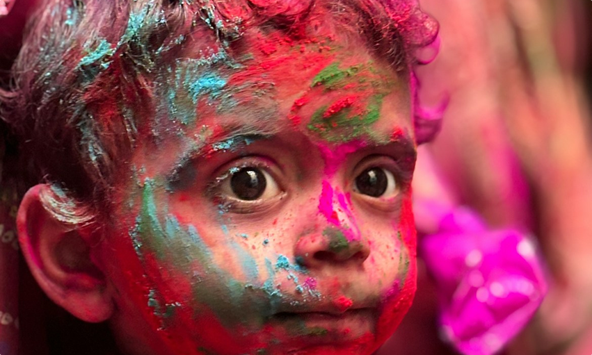
The emotional power of color
Every color carries a specific meaning and can trigger a distinct emotional response. Here's a brief look at some of the most common colors and their psychological associations in UI/UX design:
Blue: Trust, serenity, and professionalism. Blue is a common choice for tech, finance, and healthcare brands. It's a reliable color that conveys stability.
Red: Energy, passion, and urgency. Red is an excellent choice for calls-to-action (CTAs) and notifications. It can also be used to convey a sense of excitement and boldness.
Green: Growth, health, and tranquility. Green is often used for brands in the environmental, health, and wellness sectors. It’s a calming color that symbolizes freshness and nature.
Black: Power, elegance, and sophistication. Black is a key color in minimalist and luxury branding. It creates a sense of authority and modernity. White: Simplicity, cleanliness, and clarity.
White is often used as a background color to create a sense of space and focus. It's a versatile color that helps other colors stand out.
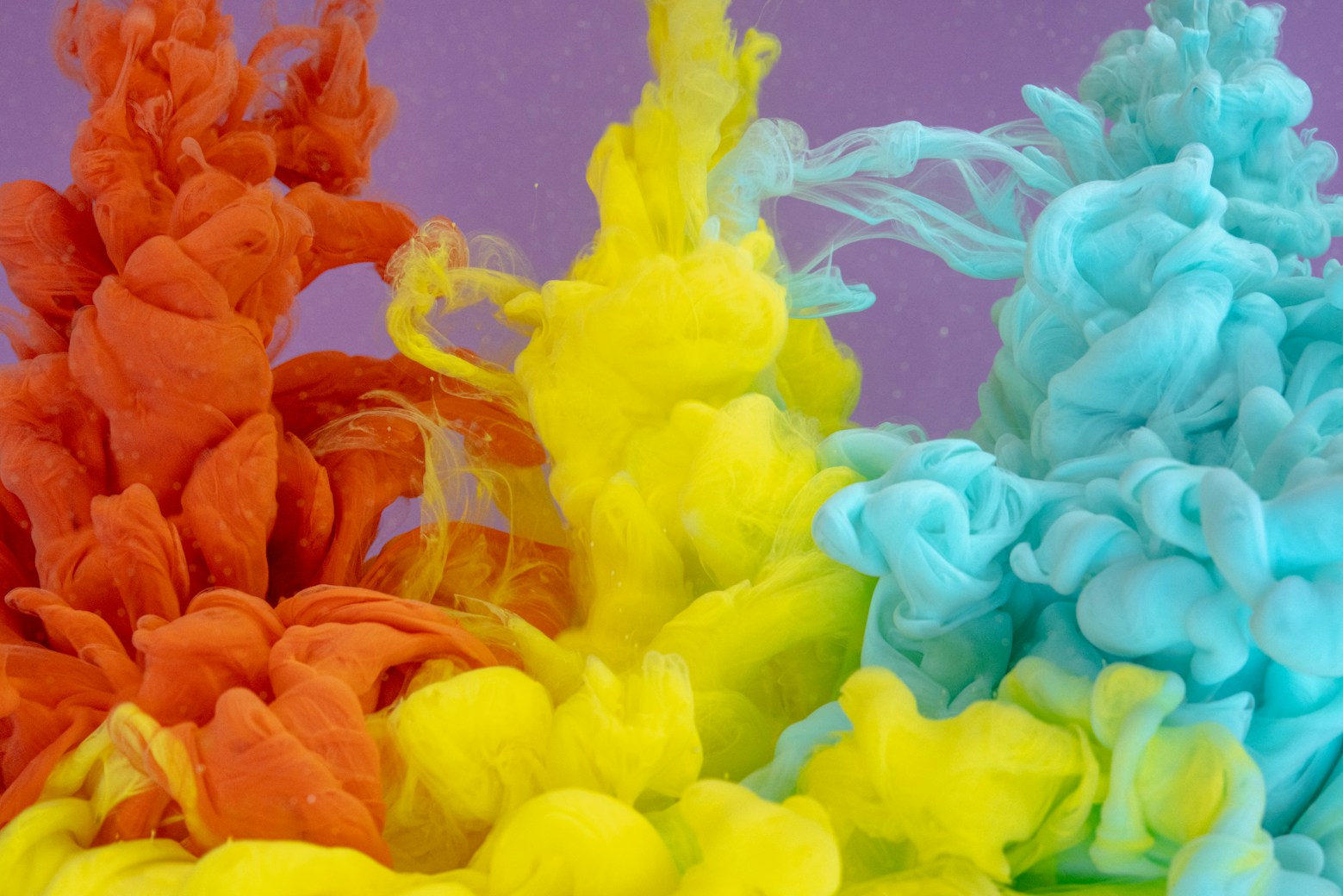
The importance of color contrast
Color contrast is a fundamental principle of good UI/UX design. It ensures that your text is readable and your interactive elements are easily identifiable. A high-contrast color scheme can:
- Improve accessibility: Ensure your website is accessible to users with visual impairments.
- Enhance readability: Make your text stand out, reducing eye strain and improving the user's reading experience.
- Guide the user: Use color contrast to draw the user's attention to key elements like CTAs, forms, and important notifications.
Color as a Call-to-Action
Color serves as a potent instrument in steering the user's experience throughout their journey. In the realm of digital product design, the strategic placement of a high-contrast call-to-action (CTA) button can lead to a remarkable boost in conversion rates. For instance, utilizing a striking red or a lively green button can effectively capture a user's attention, compelling them to take the desired action.
The essential aspect is to apply color with intention and restraint, ensuring that your CTAs not only stand out but also enhance the overall user experience without causing visual clutter. By thoughtfully integrating color into your design, you can create a more engaging and effective interface that guides users seamlessly toward their goals.
Your brand's story, told in color
Color is an essential element in defining your brand identity, acting as a powerful visual language that tells your unique story and aligns with your mission and core values. In our collaborations with clients, we take a holistic approach that transcends the mere selection of a color palette; we craft a detailed and thoughtful color strategy specifically designed to meet the distinct needs of your brand.
Our expertise guides you in selecting colors that not only evoke the desired emotions but also build trust and foster a deep connection with your audience.
We aim to ensure that your brand's distinctive message is conveyed with utmost clarity and confidence, leaving a memorable impression that resonates beautifully with your overarching vision.
Conclusion
Color is a key part of your brand identity, and it should tell a story that aligns with your mission and values. When we work with clients, we don't just pick a color palette; we define a color strategy. We help you choose colors that evoke the right emotions, build trust with your audience, and communicate your brand's unique message with clarity and confidence.
The result is a digital product that not only looks beautiful but also connects with your audience on a deeper, more meaningful level.
.jpeg)


.jpeg)
Every time.
together.